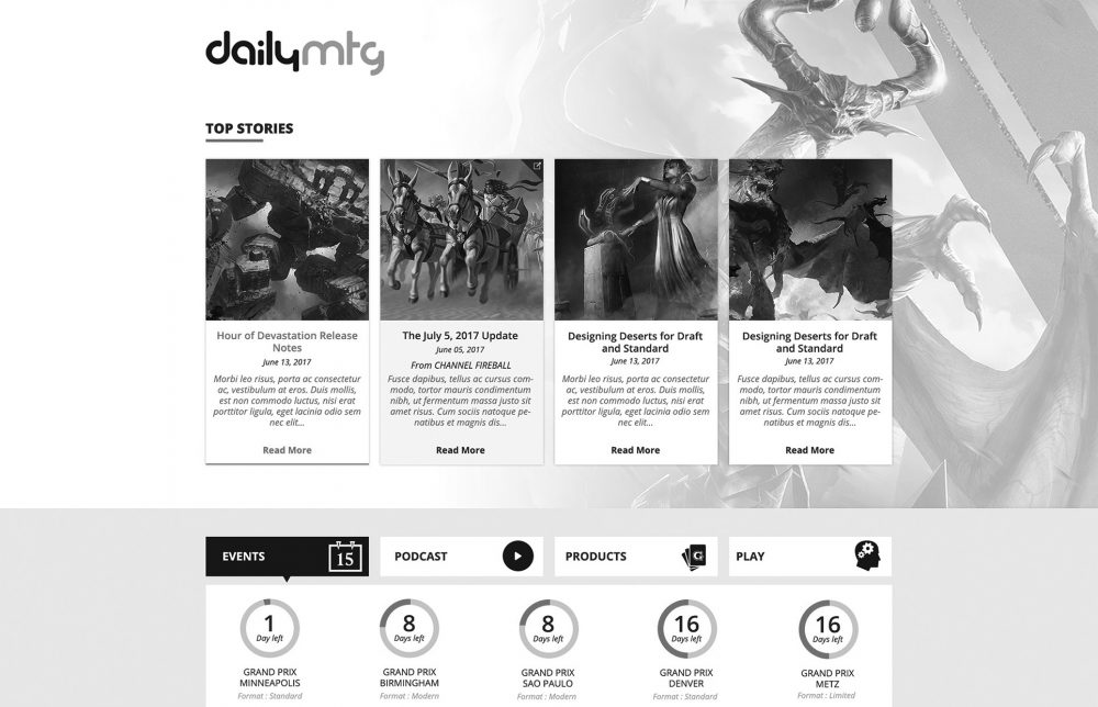
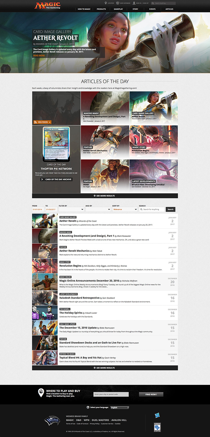
This was a very exciting project due to the fact that this is the most trafficked are of the Magic site. We hadn’t really made major improvements to this section since the main site redesign.
The owner of the project came to us with goals and features he would like to have. It was our job to do all the research, get in a room, brainstorm, re-do the hierarchy and whiteboard our vision.
To prepare for this project, i looked into a lot of major publication websites, not only in news, but in fashion. I believed these ideas would do our signature fantasy art the most justice, while guiding us in the right direction for clean information organization.
Daily MTG is viewed by some of our savviest, biggest fans. A lot of them bookmark this part of the site and skip the homepage. The most exciting part about this project was the fact that Daily MTG had evolved so much, it wasn’t just articles anymore, we had to have a place for podcasts, as well as video content and information on upcoming products and events. It was supposed to be a one stop shop for everything MTG.
We implemented a modular design that would be able to be customized according to the season’s specific needs, wether we need to feature video content, preview cards or highlight stories, we wanted the editor to own the flexibility to curate the experience based on what’s most important.
The design ended up being not just easier to navigate, but also a robust, more editorial and cinematic approach to Daily MTG. It was well received internally and externally. Viewership went up by 37%.


