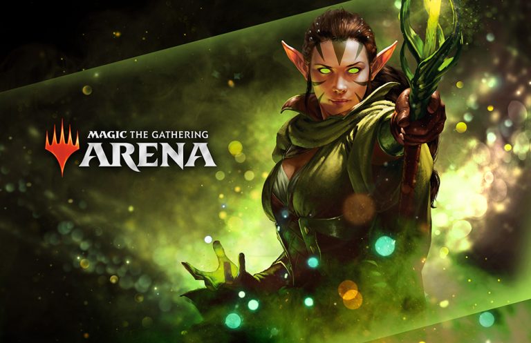
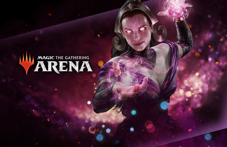
This project was for an upcoming product, and it involved creating the look and feel, as well as a guide, which would affect future print and digital expressions. Below are two of my approaches.
The first option, was something very different from what we usually saw from Magic at the time. I got lose inspiration from Alien posters, Pacific Rim, and references for glass and light art installations. These examples provided drama and mystery and played well with pipeline items like teasers, animations, etc.
The second example, was a safer style that went more in line with what our stakeholders would gravitate towards for Magic. Again, leaving opportunity for these assets to be fun to animate and use on all campaign assets.