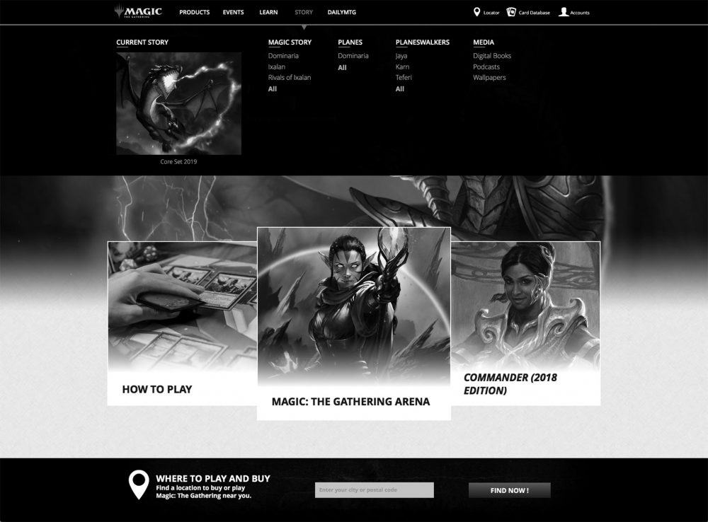
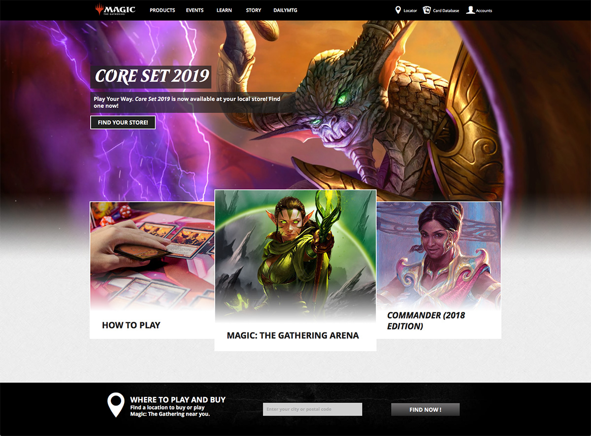
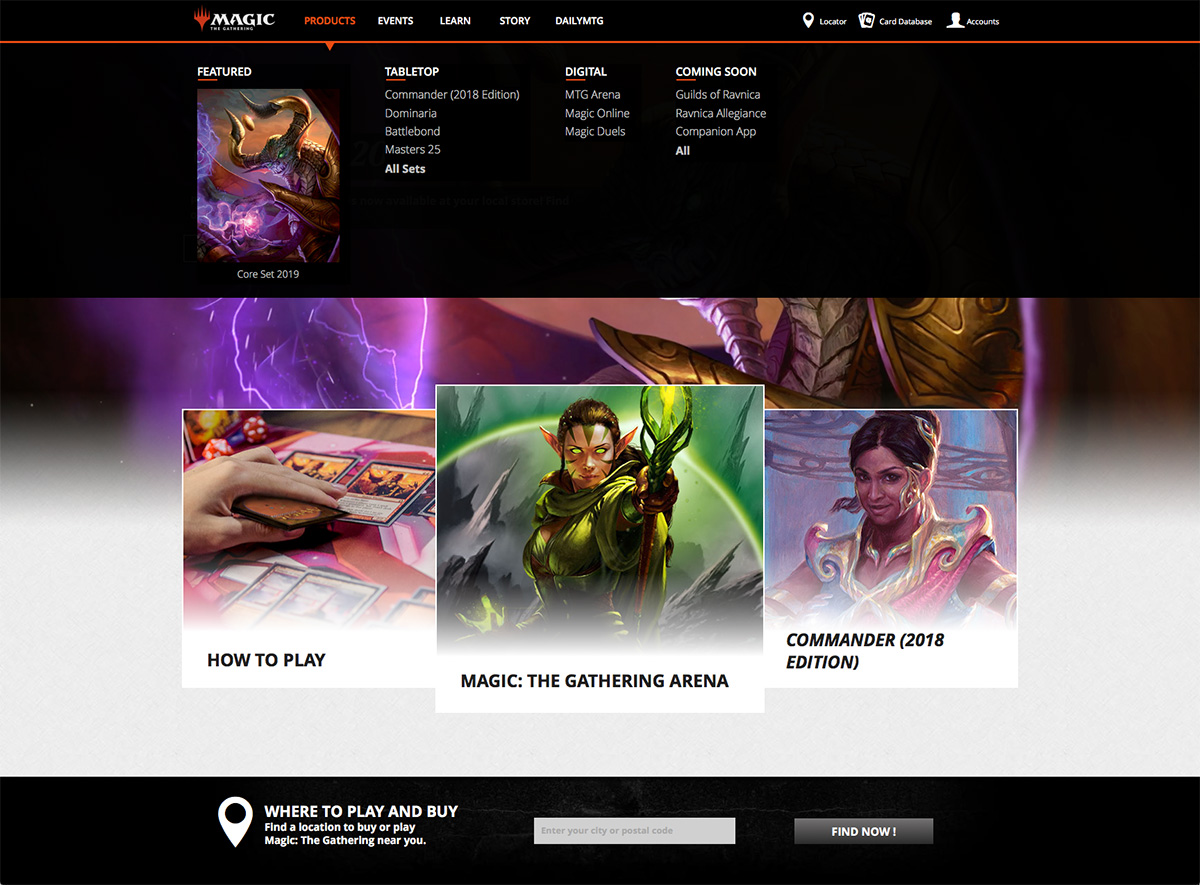
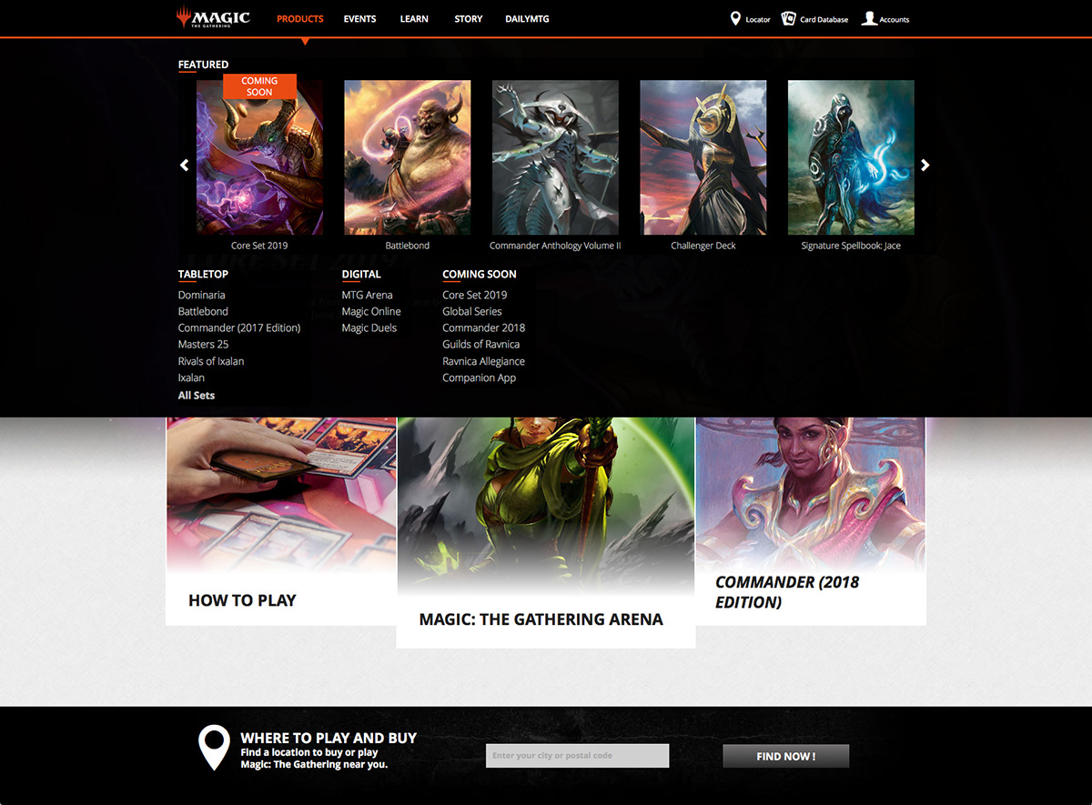
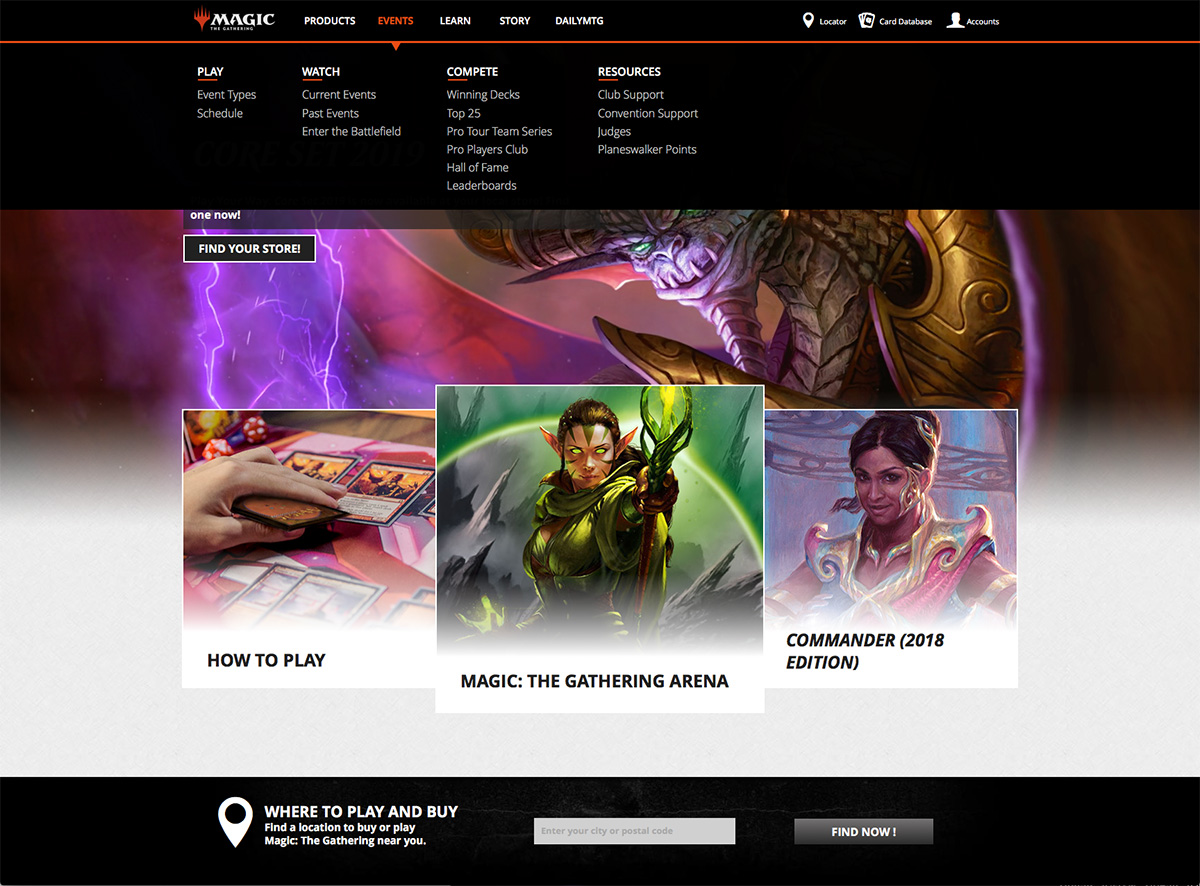
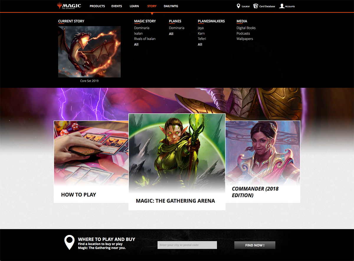
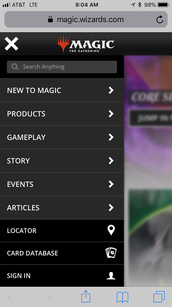
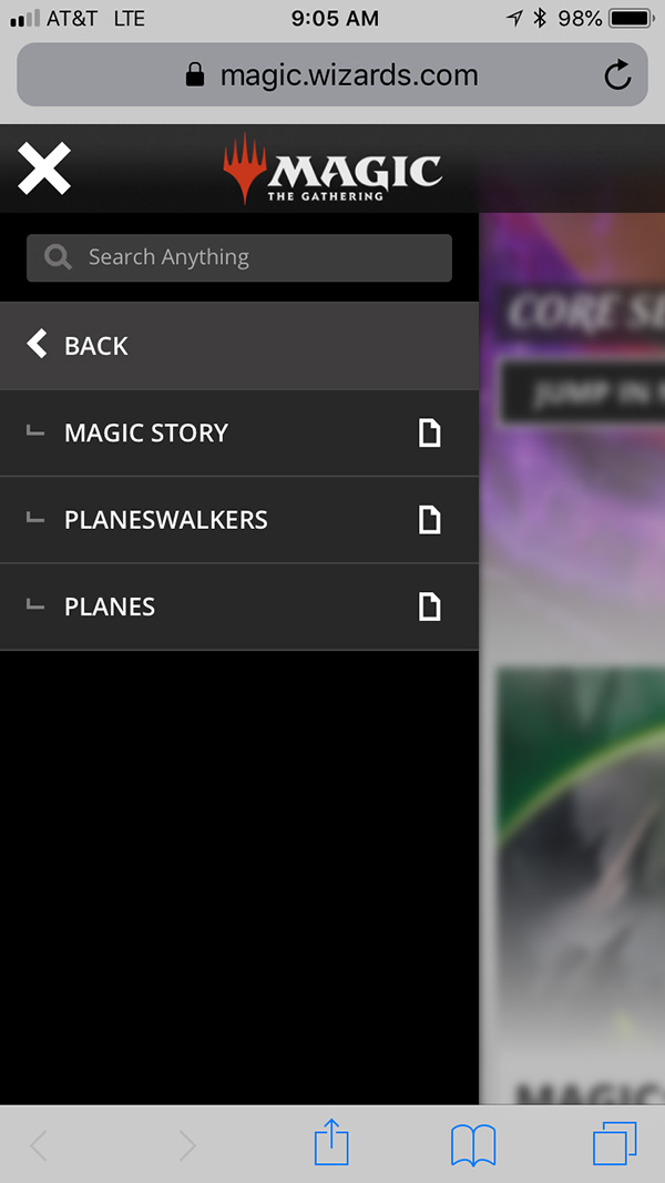
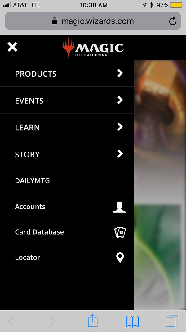
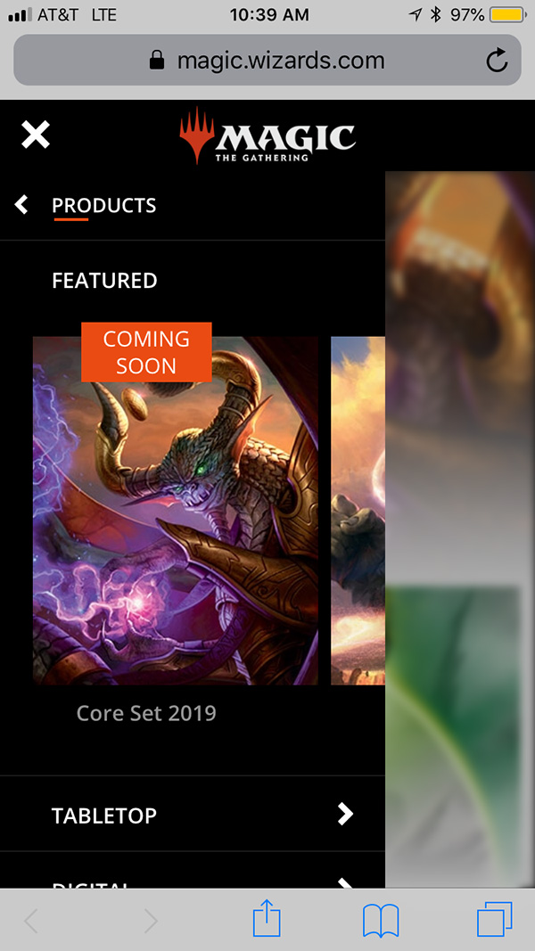
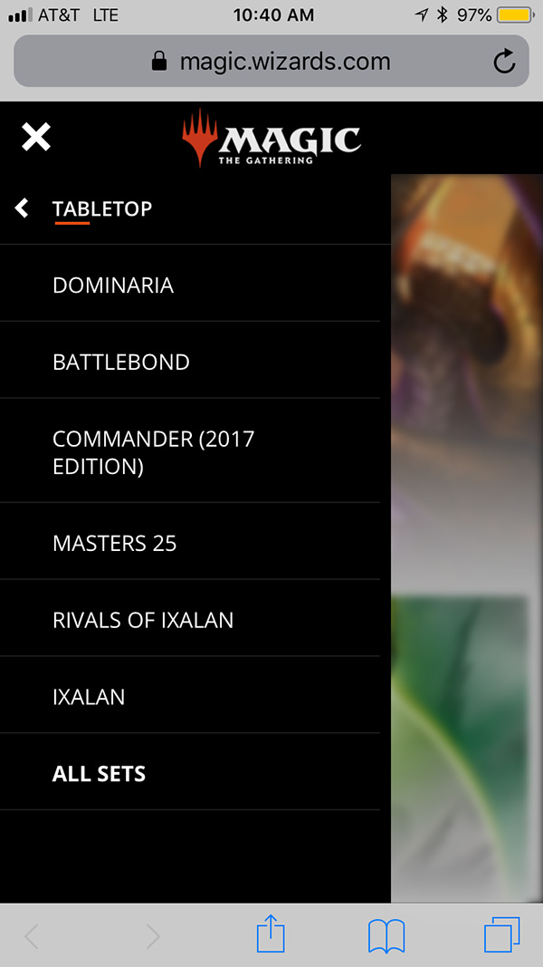
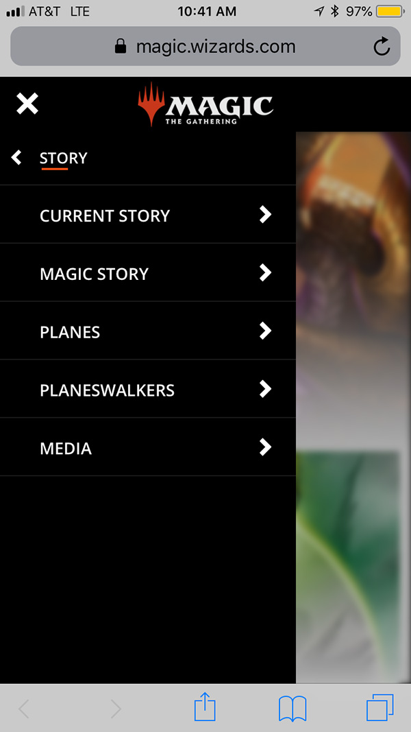
Our team had made several attempts at re-designing Magic’s site navigation over the last few years. I believe the implementation of this redesign was due to a perfect storm of having the right people and the right ideas at the right time.
Following the example of the Daily MTG and Product Page redesigns, this project required a long planning period to reorganize the site’s hierarchy in a more organic way. We are undergoing big efforts towards user acquisition, so one of the main drivers of this redesign was to help new or potential players encounter an experience that caters to them and eases them into our products, events and flavor, without neglecting current users.
I had been trying to pitch the idea of having a navigation that displayed all contents in each category at once, since it took the guess work that is usually involved in nested drop down menus (which is what we had). In collaboration with a producer and our Senior Designer, we were able to research what was out in the wild and how we could make improvements that would specifically benefit our needs. I collaborated with our Senior Designer in the creation of comps for our vendor and we provided feedback.
We implemented a flexible featured section that could be curated to display one or more images of new or upcoming products. We also found this useful for our Events and Story sections. The new navigation was received without incident.
