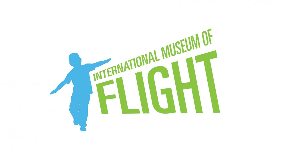
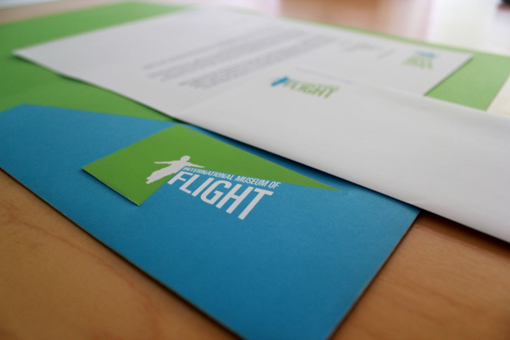
The International Museum of Flight was one of my favorite projects in college. It was awarded Best Graphic Design Award at the 2008 Annual UTEP Student Art Exhibition, juried by Monica Ramirez-Montagut and Bradford Lawton.
We were asked to create an identity for any client of our choosing. At the time, I was very intrigued by airport signage and graphics on airplanes, so I decided to create something related to both. Once the subject matter was chosen, I did some research on other flight museums and they all seemed pretty dry, serious and not that appealing to new younger audiences. I went through several scenarios before I settled on my final idea. In the end, I wanted something that evoked childlike wonder and excitement. Probably one of our first memories of airplanes has got to be running around pretending to be one. The text treatment was meant to follow the trajectory of the illustration. My color choices were based on the idealized image of the difference between earth and sky. Although the final logo does reflect childlike wonder, it is easy to relate to by adults.


