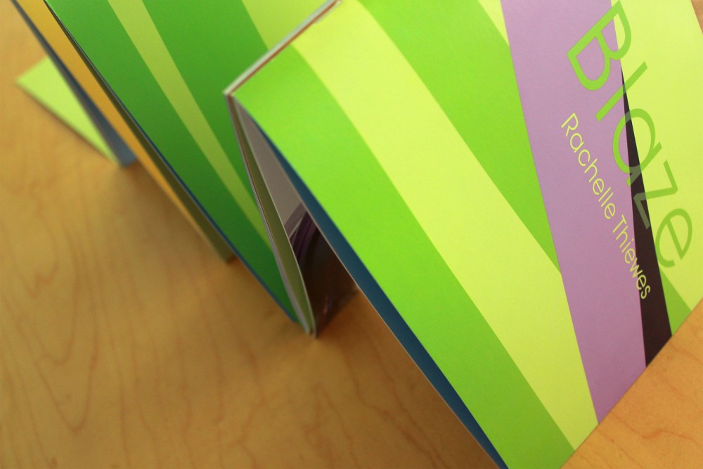
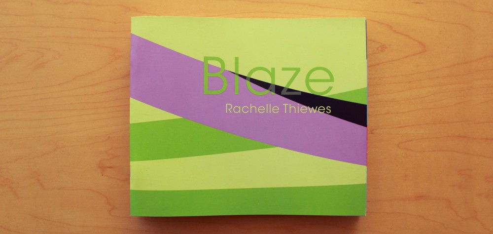
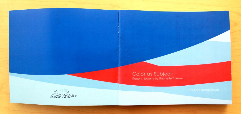
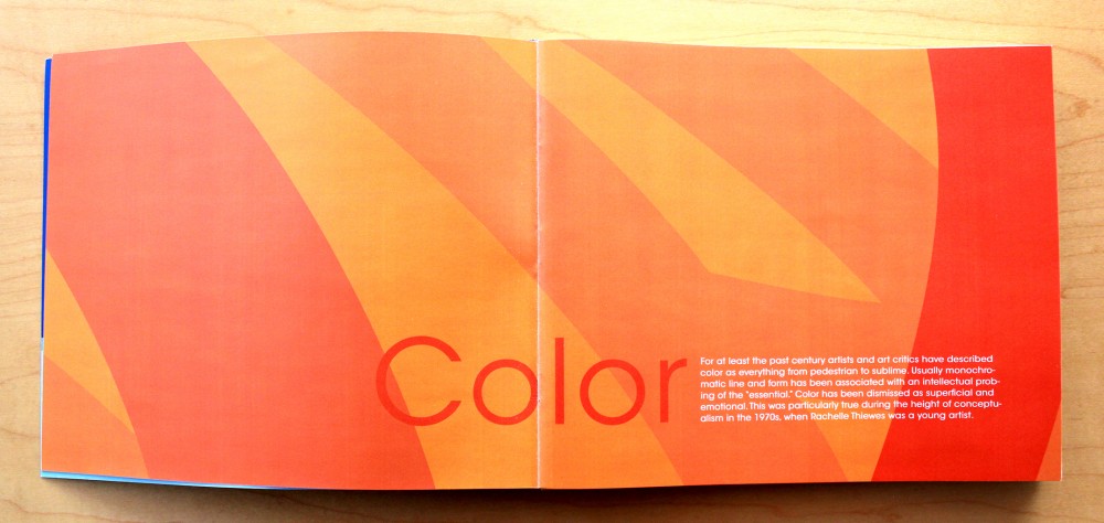
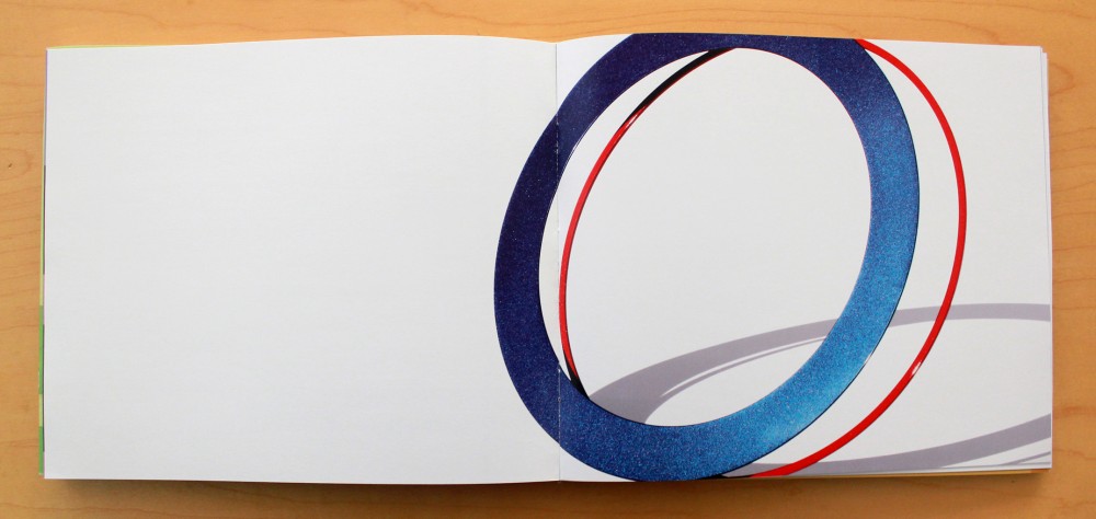
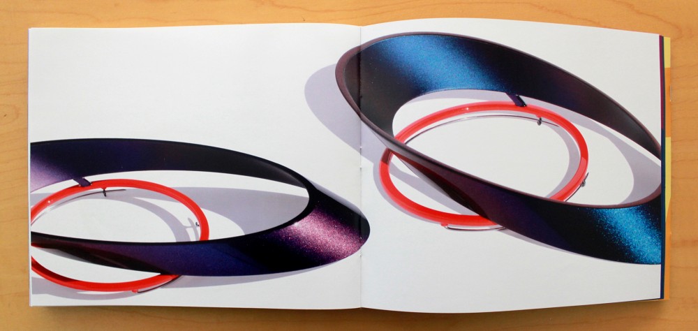
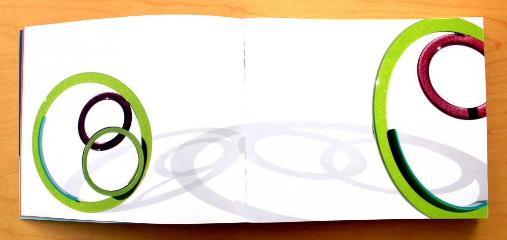
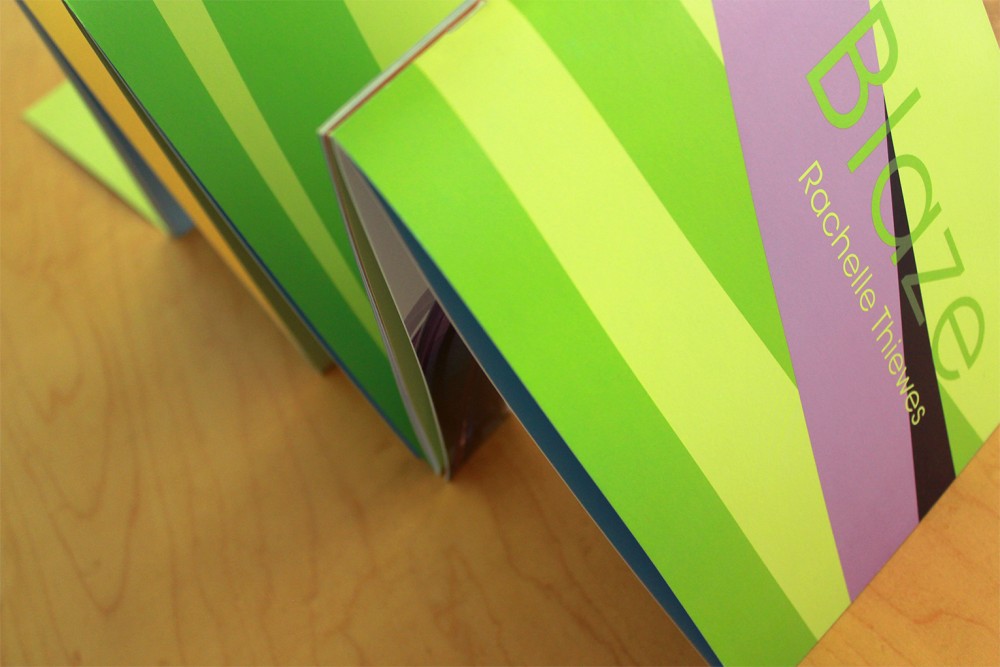
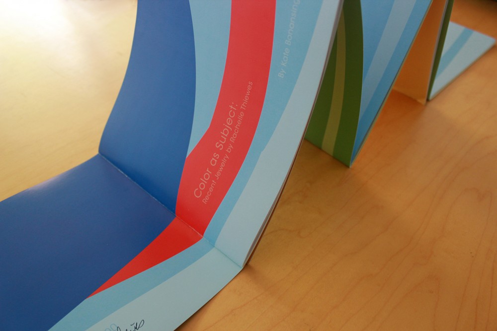
This book is by far one of the most fun I’ve ever had the opportunity to work on. I’ve always found Rachelle’s work very inspiring and provocative. I knew that this book needed to be bold, as is always the case when it comes to a design for Rachelle. I also really wanted to try to make this project into more than a book design, in the same way that her work is so much more than just jewelry.
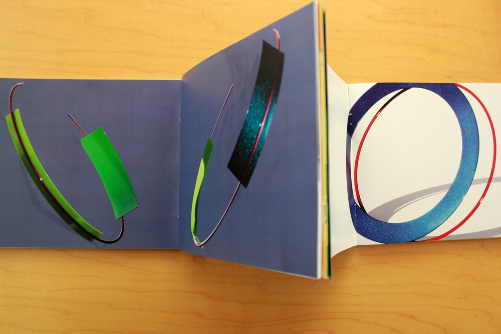
Rachelle has photographed her own jewelry for a long time. This time I focused a lot on how it’s always very important for her to capture a combination of the widest range of color and the most interesting shadows cast by the piece. I decided to create illustrations of some of her most interesting photos, using the colors featured on each one. At first I thought that maybe we needed to have a lot of foldouts inserted throughout the book, but then that idea morphed into making the whole book fold out into a series of smaller booklets. When completely extended, the book could take the shape of one of four different long panels. Additionally, flipping through the booklets in this state could make up a variety of different compositions, at the same time mirroring the possible layers of color that can be seen on her jewelry.
