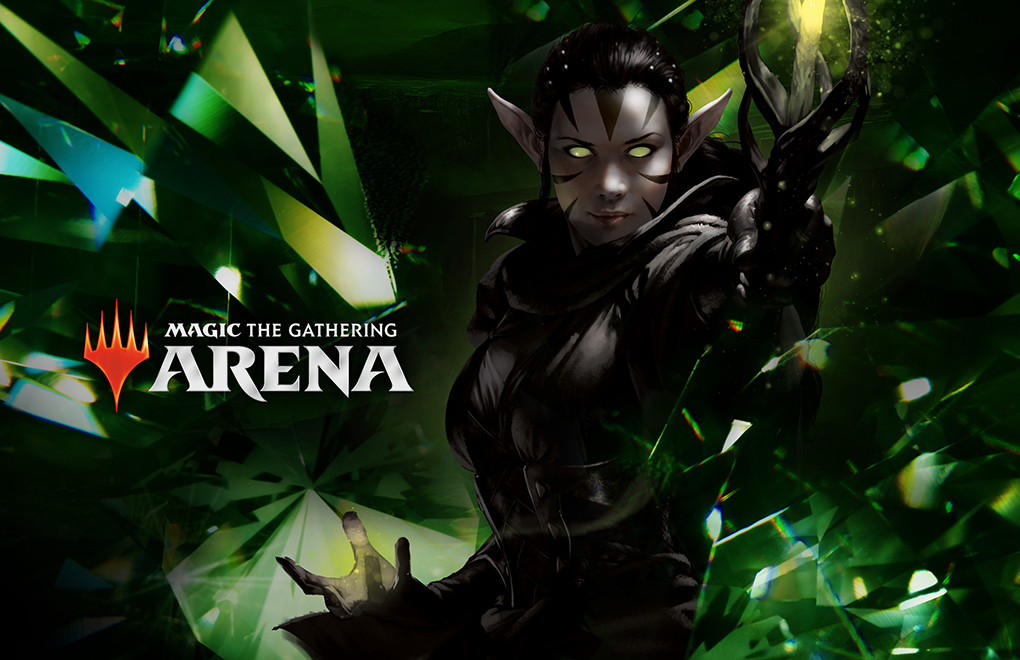
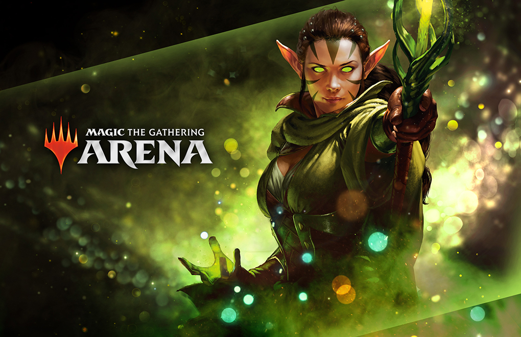
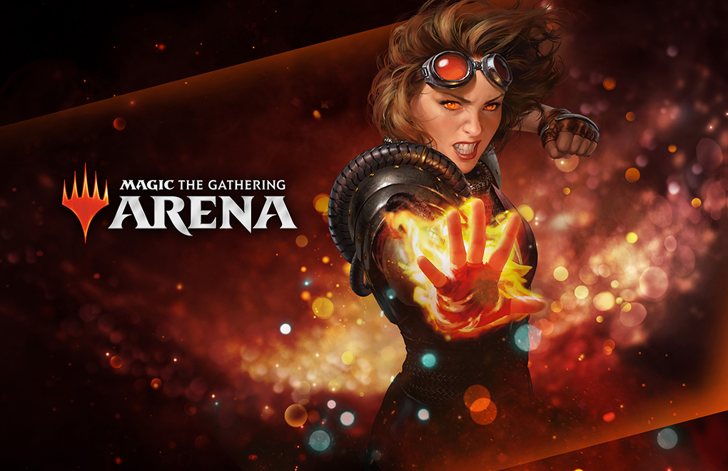
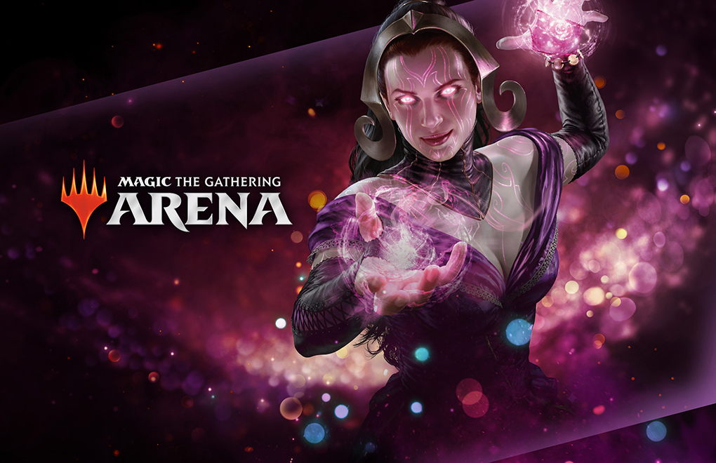
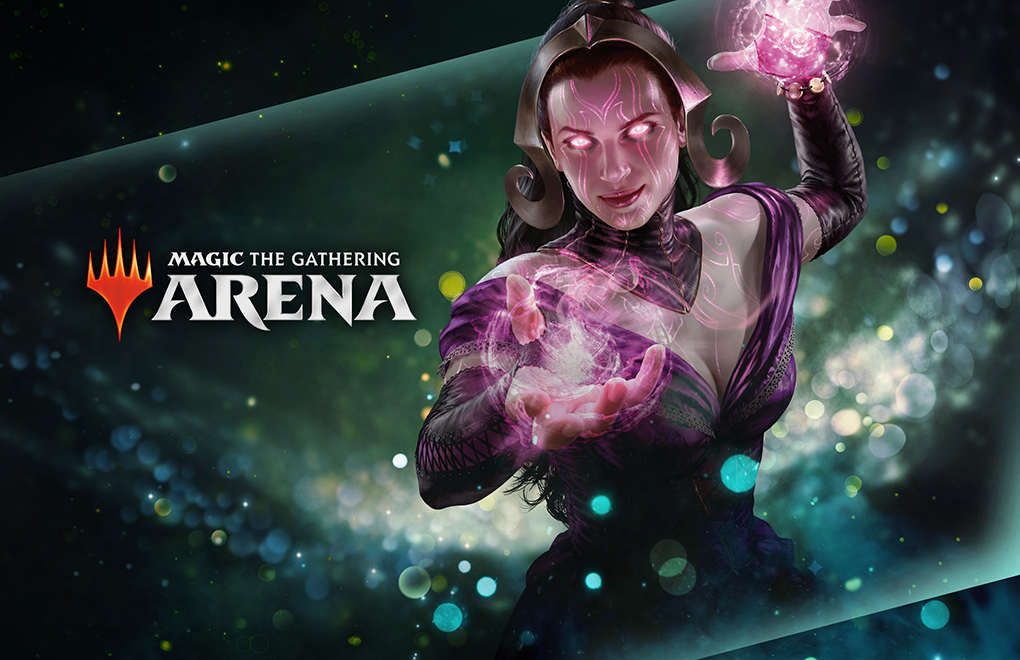
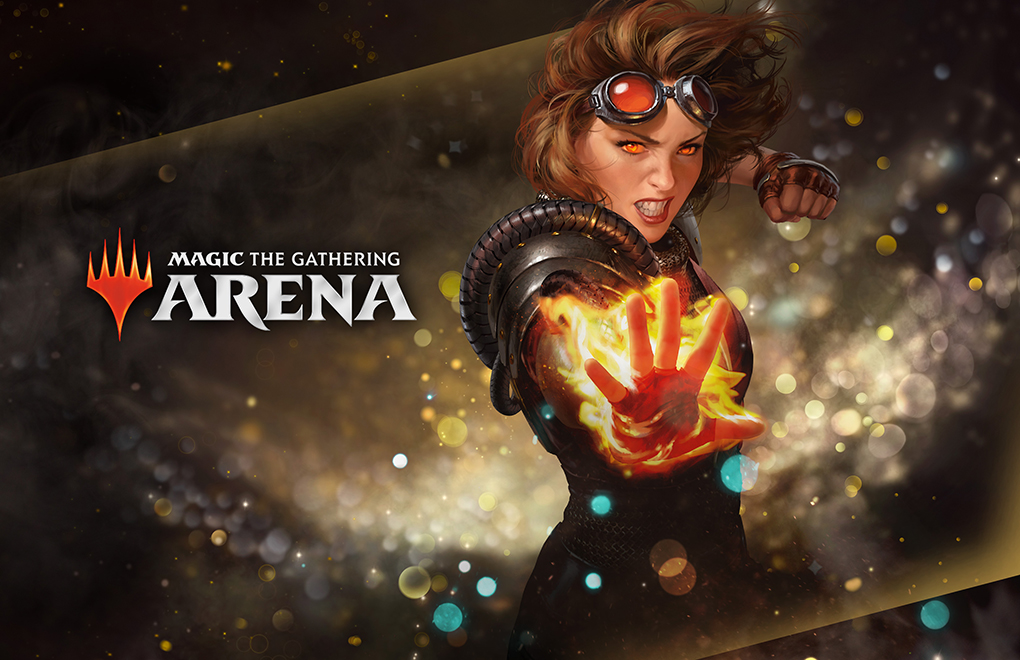
Our team encountered the opportunity to inherit a project from another team that wasn’t able to continue their exploration. This project was for an upcoming product, and it involved creating the look and feel, as well as a guide, which would affect future print and digital expressions. To achieve a wide variety of options, our Creative Director recruited four designers to come in with inspiration ideas, narrow down to the favorites, begin designs, make changes based on his direction and our collective feedback, and create digital comps for him to show to stakeholders, intending to walk away with their final selection to move forward.
Below are two of my approaches. For the first option, I decided to go with something very different from what we usually see from Magic. This was inspired in part by Alien posters, the end credits for Pacific Rim, as well as glass and light art installations. I felt that these examples provided a lot of drama and mystery and presented amazing opportunities for teasers, animations, etc. As for the second example, I went with a safer style that went more in line with what users expect from Magic. I applied a bokeh texture as well as smoke to create depth surrounding the character, and that look of “spells”.
